DesignOps
Date: 5th August 2026
What you'd know only if you worked with me
A Figma file is my workspace, but for everyone else, it's the only context they have. These are the three moments that break trust fastest, and here's how I ensure better collaboration.
RateSense
Web App
File
Assets
Pages
💥 Cover
🔗 Important Resources
⌛ Timeline
🎯 Deliveries
Sprint 1
As a User, I want the ability need the ability a text using WriteSense
JIRA Story ID
WS-21
User story
This story focuses on enabling users to identify the appropriate asset class
Approved

Your fav Dev
Behind
Deliverables
The Problem
The onboarding tax
A new hire, a PM two sprints behind, a dev picking up a ticket each opens the same file and pays the same tax: ten minutes figuring out where should I even start?
The Solution
A File Map, Not a Maze
There's no universal standard here. Every designer, every team has their own working philosophy for structuring a file which is exactly why a "README" carries so much weight.
It's not documentation for its own sake, it's the translation layer between how you think and how everyone else needs to read it.
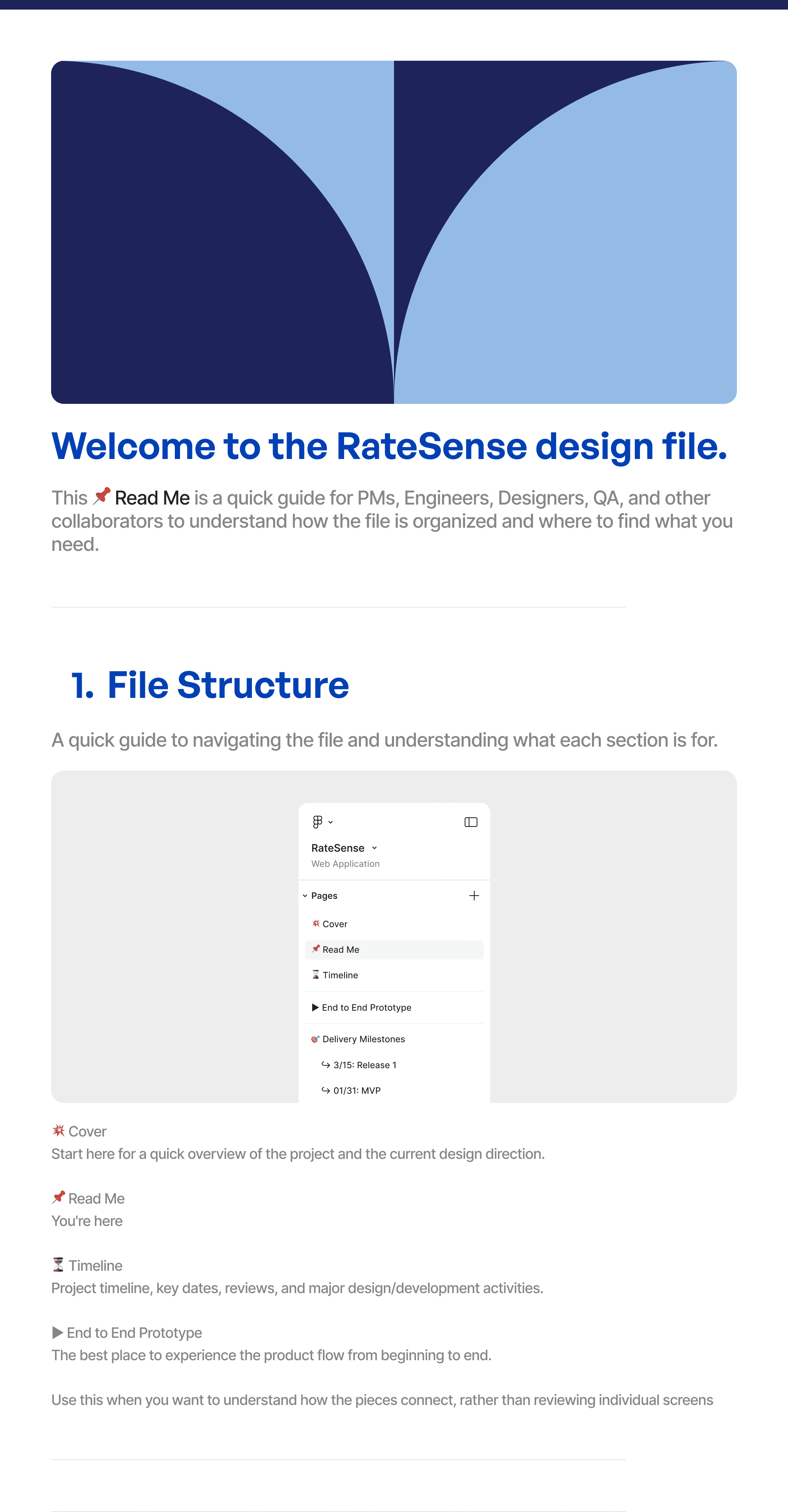
Side Panel
It starts with a clean, organized, and labeled side panel.

Cover Page
The cover page sets scope, ownership, and status up front, so nobody has to guess what they're looking at.

Context & Resources Section

Read Me

Context & Resource Section (Most Important)
There's no universal standard here. Every designer, every team has their own working philosophy for structuring. So Creating a README section helps everyone stay on the same page.
Timeline

Timeline
A running log of what shipped, what's in flight, and what's next. So anyone can tell where the project stands without asking.

The Problem
The final_FINALLLLLL problem
PM asks “are we on track?” and the honest answer is a shrug as nothing in the file ties a screen back to an actual requirement, so “progress” becomes a feeling, not a number you can measure
The Solution
Screens tied to the “Why”
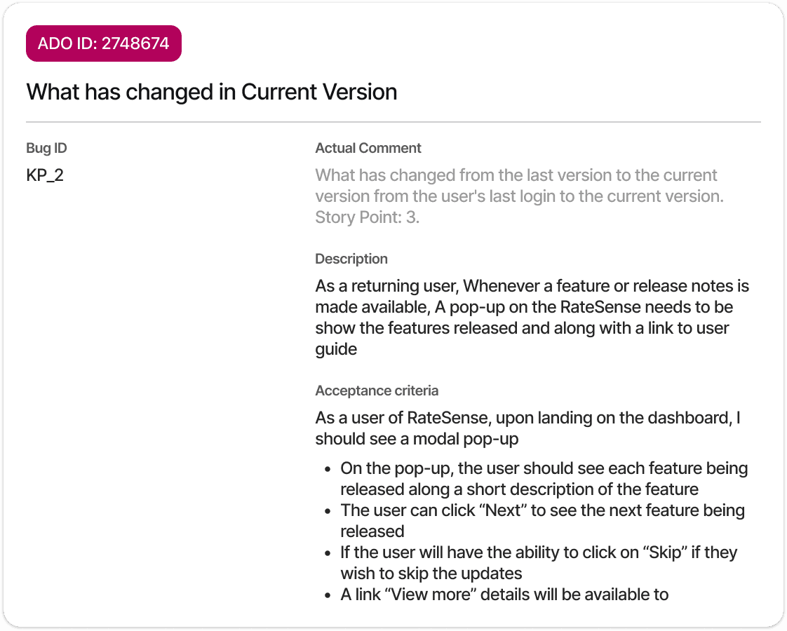
Every flow is labeled against the user story or ticket it serves, with a coverage checklist sitting right beside it. So progress reads as "6 of 8 stories covered," a number, not a vibe.
User story
Screen

Figma Pages are grouped either by sprint or delivery milestone. Once a design ships, the page gets marked ready for dev and the tag changes with it.

Every component follows a consistent naming convention with each sub-element's role documented, so developers can identify, reuse, and extend components without reverse-engineering intent from the visual design alone.

The Problem
The decision black box
The Figma file shows what shipped. The file doesn't show what were all the possible design choices and why we didn't go a certain way.
The Solution
Screens Tied to the “Why”
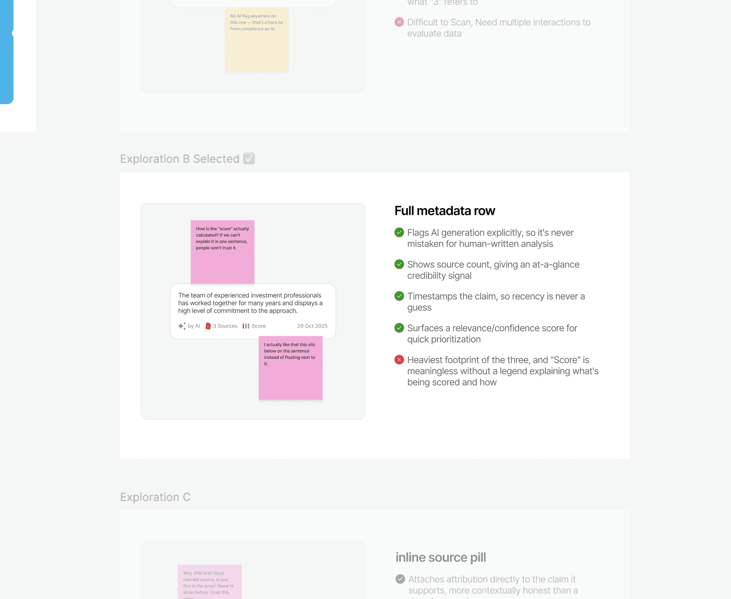
Why we chose, what we ruled out, and rationale behind every decision gets logged. So, the context doesn't leave when the person does.

Every discovery or design critique session's feedback gets logged as stickies right on the canvas along with meeting summaries. So the discovery stays one click away!
A running future-ideas list, so a good idea that missed this cycle's scope doesn't just disappear. It just waits its turn, like everything else on my to-do list. 🥲
