From Complexity to Clarity : Enhancing Citi Connect's B2B Payment Dashboard for Faster Financial Insights


Timeline
6 Weeks
Client
Citi Connect
The Team
2 Product Managers
Design Lead
Product Designer (That's me🙋)
Technical Lead
6 Engineers
My Role
Product Research
Conceptualization and High-fidelity Prototypes
Stakeholder evaluations & design critique sessions with SMEs
Collaborated with PMs, Engineering teams to create documentation for seamless hand-offs.
👀
A Sneak peak
Users struggled to find relavant payment records due to Outdated UI paradigms and excessive data cluttering the screen through endless data tables

The Problem?
Finding and reconciling payment records is Slow, cluttered, and overly manual for treasury managers
The solution

Chrome
File
Edit
View
History
Bookmarks
Profiles
Tab
Window
Help
Mon Jun 22
9:41 AM
Locked, Password Required

Citi Connect - Home
Home – Confluence
connect.citi.net/home


Impact
The redesigned Citi B2B Payments Dashboard was successfully launched after an intensive 4-week design sprint
Customers served
Capstone Project Showcase
Increase in User Engagement
Capstone Project Showcase
Increase in Report Downloads
Capstone Project Showcase
🚀
Deep Dive
Business Goal
Develop a Minimum Viable Product (MVP) that provides hyper-personalized travel experiences, leading to higher user acquisition and potential monetization opportunities
My Personal Challenge
Unfortunately, We didn't have direct access to end user until later in project!
My work around
No collaborative AI-powered trip planner that helps groups coordinate plans seamlessly.
Key Partnerships
Travel booking platforms: Hotels (Booking.com, Expedia, Agoda)
Flights (Skyscanner, Kayak API)
Tours (basic partnerships for experiences)
AI/ML tech providers (OpenAI, Llama for route personalization).
Influencers for early beta testing & launch push.
Key Activities
Travel booking platforms: Hotels (Booking.com, Expedia, Agoda)
Great for itinerary organization
Great for itinerary organization
Customer Relationships
Optional personalization adjustments to fine-tune profile over time.
"Smart match" system recommending trips based on user's evolving personality
Channels
Mobile App (Primary) — iOS & Android (direct download).
Customer Segments
Frequent travelers (both leisure & business) looking for quick trip curation.
Millennials and Gen Z travelers who prefer personalized, plans.
First-time travelers seeking simple and fast itinerary solutions.
Small groups & solo travelers needing flexible planning.
Occasional travelers who want easy plug-and-play trips without research.
Great for itinerary organization
Great for itinerary organization
Timothy
Chandan
Business Model Canvas
Problem to solve
Develop a Minimum Viable Product (MVP) that is scalable and capable of generating future revenue streams.
Design Goal
Develop a Minimum Viable Product (MVP) that is scalable and capable of generating future revenue streams.
Research
We managed to acquire summaries of customer support tickets and previous product discovery documents. We collaborated with PMs and SMEs to gather second-hand insights
5
User scenarios
identified
8
User Jobs-to-be-done outlined
12
Pain-points uncovered using Heuristic Analysis
Based on preliminary research, We Identified multiple Jobs-to-be-done by the user, Using which we ideated probable solutions and narrow down the solutions based on feature prioritization matrix
An example of Job-To-Be-Done
Actor
As a Treasury Manager.
Situation
when I need to track overdue payments across global accounts,
Motivation
I need to quickly access Billing data to get actionable insights
Outcome
So I can prioritize tasks, make informed decisions, and ensure smooth cash flow.
Feature Prioritization Matrix
Nice to have!
Must have!
Parked for now
Can come later
Data
Color Coding
Alerts &
Notifications
Status Tags
with Tooltips
Inline Actions
Payment
Trends
Visualization
Charts
Universal
Search
Auto Alerts &
Notifications
AI Summary
Generator
Exportable
Reports
Custom
Pages
Data
Widgets
Direct CTAs
for actions
High Impact
High Effort
Low Impact
Low Effort
Since the timeline of the project was only 4 weeks, our "Must have" were the one that require low effort but yields High Impact
Chosen Ideas
• Visualization charts and Data
Widgets
• Exportable reports
• Direct CTAs for actions
• Custom Pages
Pain-point 1: Overwhelmed by the sheer volume of unstructured data
Users spent more time hunting for information than taking informed action
4.Tedious Filters
The user has to manually search the filter every time for every vendor or for accounts

2. Lack of Clarity
Does it mean this transaction is unpaid?
3. Unclear Jargon
What does empty status mean?
Does released means processed/Pending? etc?
1. Cluttered Data Layout
An overwhelming number of columns.
What Information should the user focus?
Solution 1
The system interprets data, offers insightful inputs, and summarizes essential high-level information for informed decision-making.

2. Data over the period at glance
Flexibility to view the desired data over a period of time
3. Direct CTAs
Actionable Insights to the user right at the top of the dashboard
1. Quick-access widgets
At-a-glance financial overview with key metrics surfaced upfront
Now, Clicking on the CTA will re-direct the user to pages, Accelerating payment process
5. Custom views for vendors
The user can now create custom pages of vendors for quicker access
4. Default views
Frequently visited pages are now highlighted for easier access
Pain-point 2: Overwhelmed by the sheer volume of unstructured data
The current filters are rigid and monotonous
The user has to set the filters from the beginning every time to filter specific data, making the task repetitive and inefficient.

1. Tedious Filters
The user has to manually search the filter every time for every vendor or for accounts
3. Reliance on external tools
Users must utilize tools like Excel to arrange the data and compile reconciliation reports
2. Lack of Sort & Filter Options
Column level customization is not available
Design Exploration
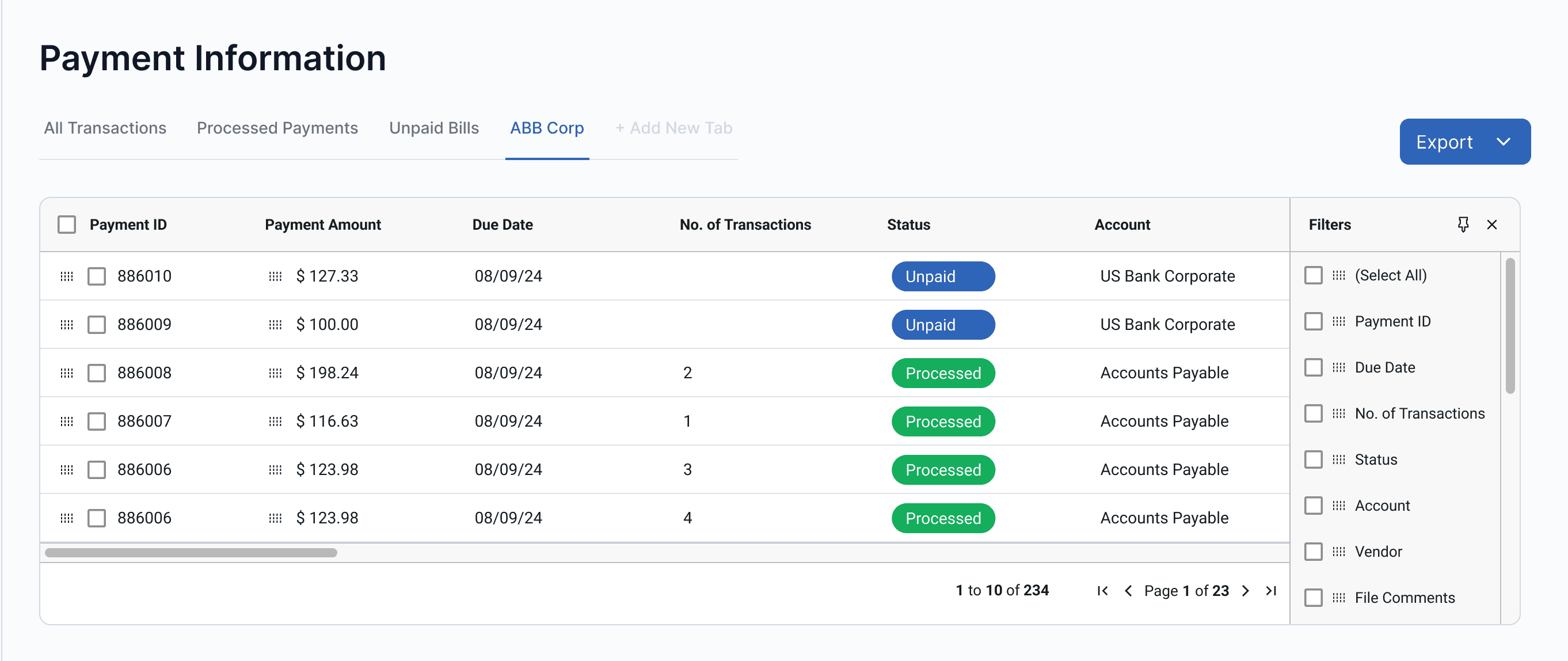
We conducted design exploration and evaluated against product needs along with SMEs to choose final designs
Design 1
A typical dropdown with checkbox
Familiar pattern, easy to use
Column selection is hidden inside a menu, making customization slower
Dropdowns can feel restrictive for large data

Design 2
Collapsable side panel with an option to pin
Familiar pattern, easy to use
Quick access to filters
Reduces table space
Design 3
Column Filters Fixed on top with a pin option
Familiar pattern, easy to use
Quick access to filters
Doesn't take much space

Solution 2
A column filter section that enables the user to customize the columns on the fly without being obstructive
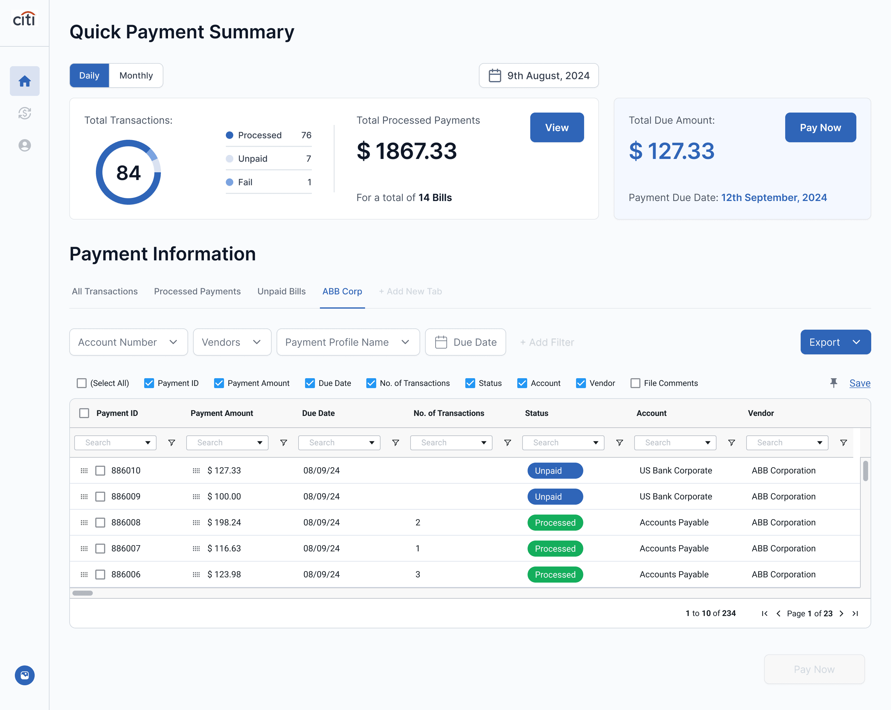
2. Column level search and filters
Enabling hyper-personalization to the users
3. Quick Export
Options
One step to generate customized reconciliation reports
Ability to Pin
Can pin the column filters to change filters on the fly
1. High-level filters
Frequently used filters to distinguish the data into various categories
User testing
Finally we have access to the users! 🎉
We began with unbiased user interviews to gain insights into their perspectives without influencing them with design-related questions.
Following this, we conducted think aloud Think aloud assessment to evaluate our designs.
4
Representative users
8
Tasks performed
Insights
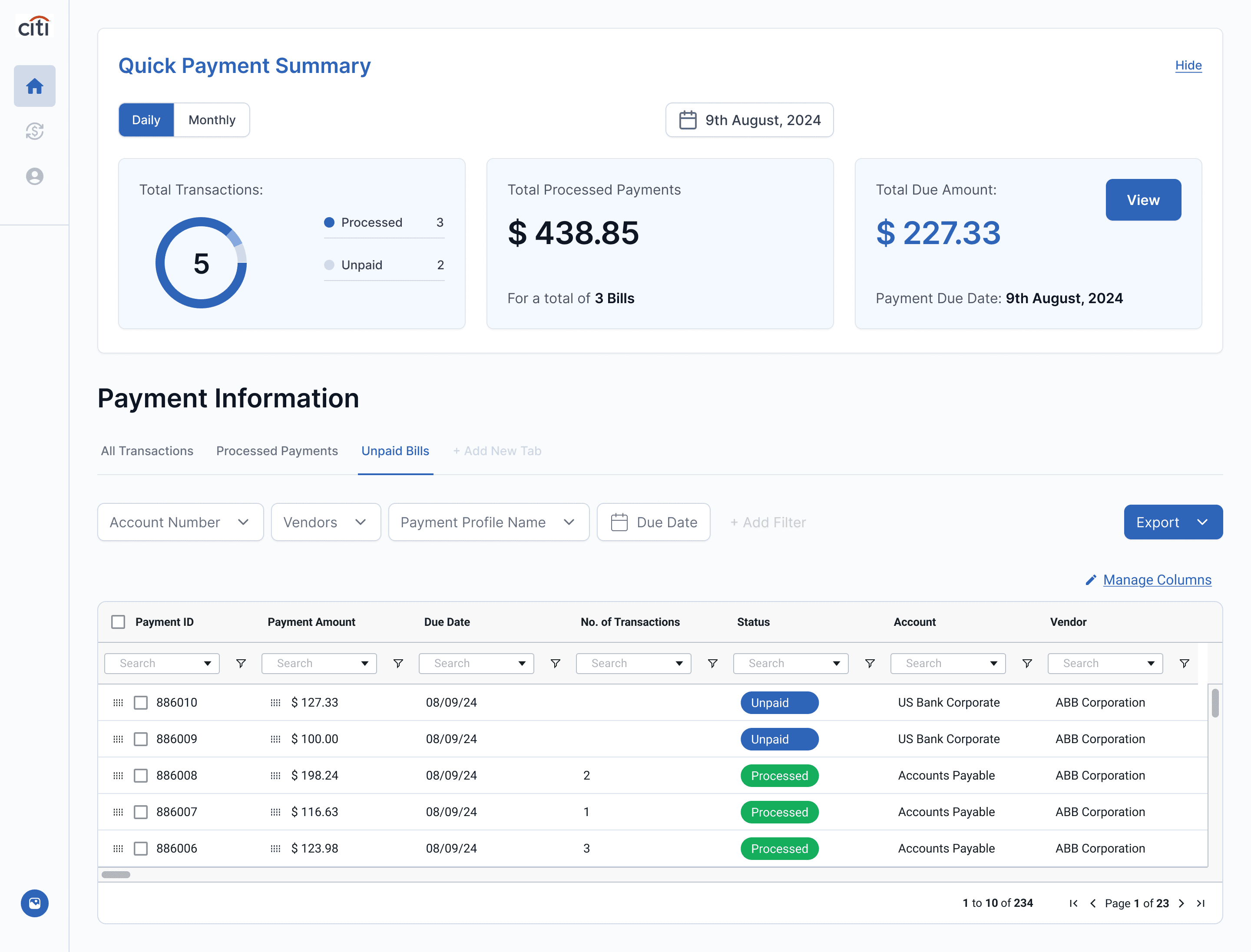
Through user testing, we found that while the Quick Payment Summary section was useful, it was only required once a day, causing unnecessary screen clutter.
All participants indicated that this feature would be more effective if it were less intrusive and allowed for better visibility of the payment information table
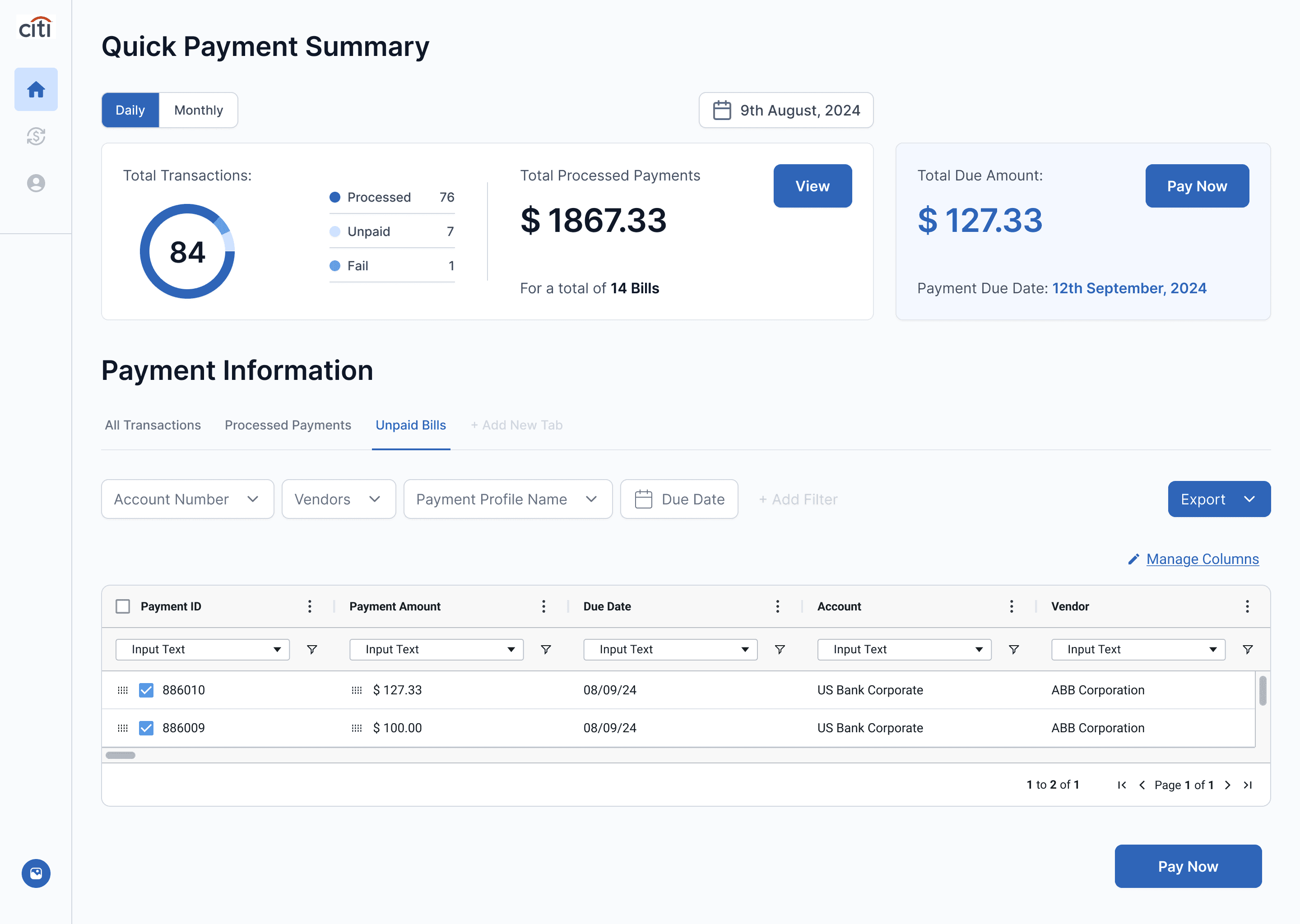
Users need the summary but not all the time.
All 4/4 participants reported that the Quick Payment Summary is useful but only needed once a day, making it an inefficient use of screen space.
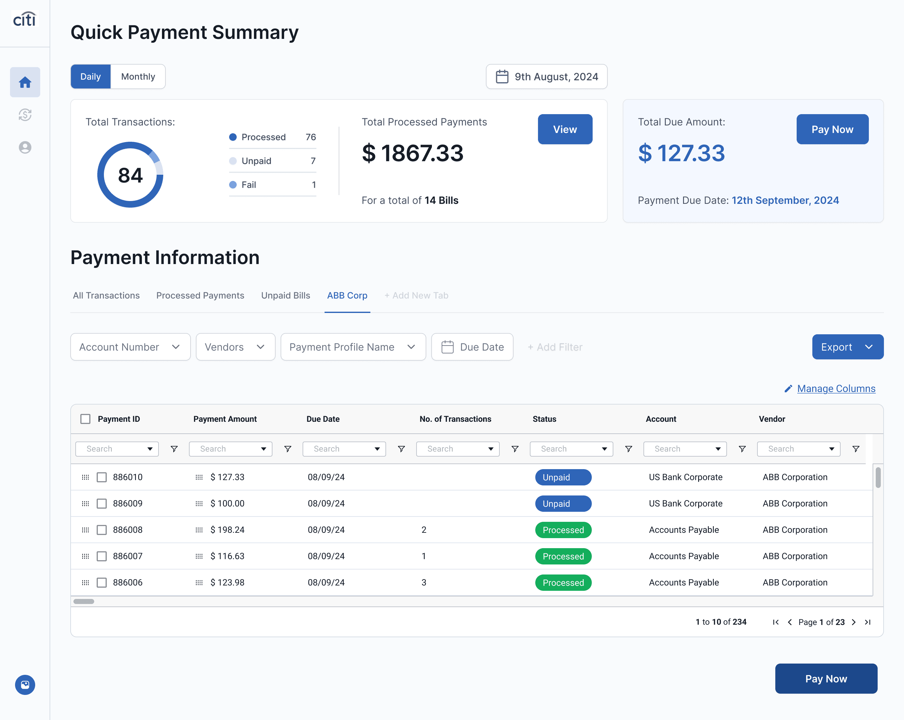
Inefficient placement of the button
The button gets lost when the user is viewing large pages of data
Iterations
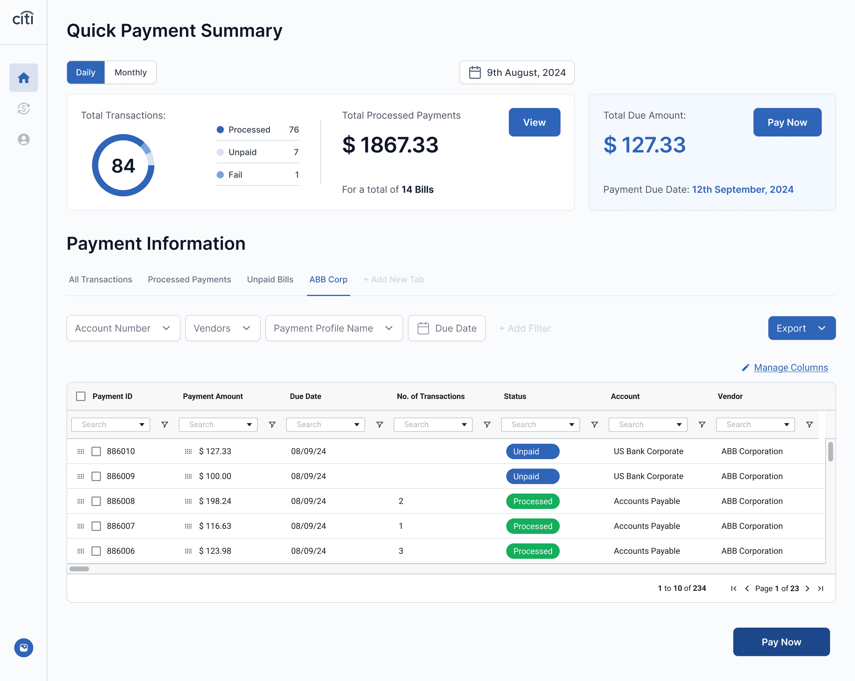
Based on the insights, we iterated on the design by transforming the Quick Payment Summary into a collapsible card. This change preserved its utility but allowed users to toggle its visibility, creating a cleaner, more efficient layout without compromising accessibility.

Re-Arranging the Pay Now button
Increasing the visibility of the button
Collapsible Card for Better Flexibility
allowing users to access it when needed while keeping the dashboard uncluttered.
Final shipped designs 🚀
Impact
The redesigned Citi B2B Payments Dashboard was successfully launched after an intensive 4-week design sprint
Customers served
Capstone Project Showcase
Increase in User Engagement
Capstone Project Showcase
Increase in Completion rates
Capstone Project Showcase
Increase in Report Downloads
Capstone Project Showcase
Chandan Jonnavithula
2025©