Client's goal

Jeannie Adair
Today 2:20pm
Hey Chandan, How can we improve efficiency in the design process, Reduce Design to Development delivery times and improve branding consistency for our clients?
You
Today 2:20pm
I know exactly what we should do!
Let’s build a centralized design system!
Defining the Problem Statement
But, Why do we need a design system?
Every time we started a new project, we were creating projects from scratch. This would mean setting up a new components library each time.
This meant we were designing the same components over and over again with the style changing each time to suit functionality.
The Solution
How did we solve the problem?
Input field
Default
Type:
Leading icon:
Label:
Hint text:
Help icon:
Destructive:
Filled
Size:
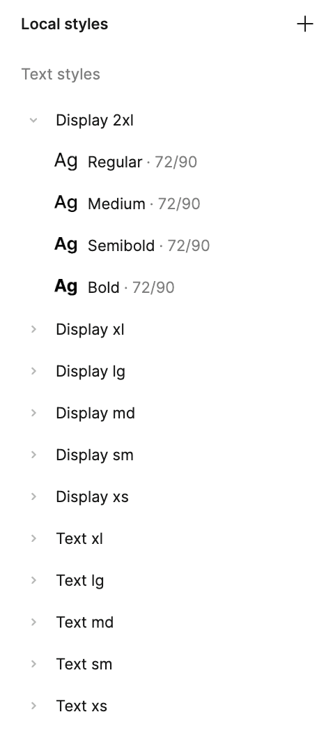
Creating nested components and variants
We created a library of nested components with multiple variants
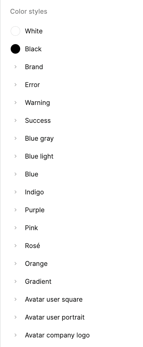
Figma Tokens
Tailored to the client's branding requirements, improving the consistency and efficiency
Documentation & Accessibility
Components were designed and developed to be compliant with WCAG 2.1 standards
Realized Impact
30% reduction in repetitive design work.
This process and strategy enabled us to Transform a Fortune 500 financial enterprise's B2B billing and payments dashboard ensuring WCAG 2.1 compliance for 100M monthly users
View Case Study

Design System Goals
Improve Consistency and enable Scalability
To Provide Consistency across all platforms/breakpoints while aligning with the each client's branding values strategy.
Enhance design and development efficiency
Enhance collaboration between designers and developers while Improving design efficiency and reduce redundant work
Accessibility baked into each step
Improve accessibility compliance
My Strategy
Find analogous Components
Identifying the Scope and constraints
Identify Value Drivers
Identify KPIs we want to improve!
Build Core-Components
This is where the fun begins!
Documentation for Dev-handoff
To Help Dev-team implement changes
Identifying the Scope and constraints
Finding analogous Components through a design audit
Ensuring that user research was integral to the construction of a Design System is crucial. We gathered insights via a positioning map from previous projects to detect repeated patterns in the component sets and requirements.
Analyzing the Components library of past projects


Creating a spec sheet

Key Performance Indicators - KPIs
Building value statements

Atomic Design
Our design system will embody the principles of Atomic Design system, creating a library of consistent, modular components that can be combined in infinite ways to build distinct and innovative designs. By adopting this approach, we aim to significantly improve our key performance indicators
Adoption Rate
Component re-usability
Deployment Rate
Building the design system
Creating core components
Created nested components as Templates so that components can easily be adopted as client's requirements

Video Demonstrating how a change in the parent component, Changes all the variants
Breaking down the sections and components for Auto-Layouts

Documentation
How can I make this helpful for designers and developers?
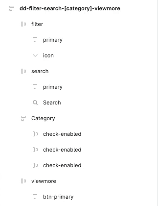
Creating a Common Language
To create a common language between designers and developers, a clear Naming convention was established:
Used a prefix to indicate the component type
(e.g., "btn" for buttons, "inp" for inputs)Followed by the component's primary function
(e.g., "primary", "secondary")Added modifiers for variations
(e.g., "large", "disabled")
dd-filter-search-[category]-viewmore
Select
Search
Category 1
Category 2
Category 3
view more

A detailed component library

Visual examples of each component in various states

Props and customization options for developers
Implementation of Design Tokens and Variants
We implemented a hierarchical token system for colors, starting with primitive tokens and moving to more semantic ones. This approach allowed for flexibility while maintaining consistency across projects.

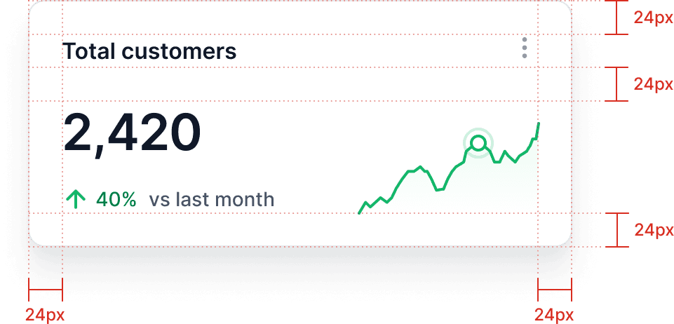
Grids and Annotation Guidelines
We established a standardized annotation system for designers to communicate specific details to developers
Using multiples of 4px grid system (e.g., "m-t: 24px" for margin-top)

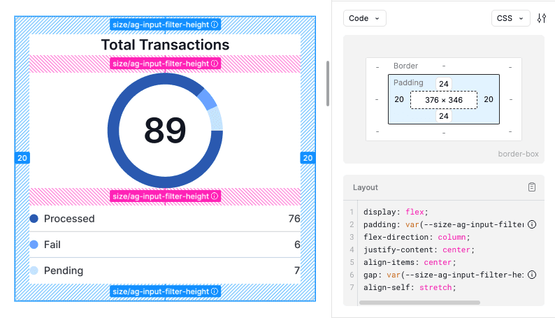
Using the Figma Dev-mode for better Dev-hand off
Figma Dev Mode provides advanced inspection tools that make it easier for developers to understand and implement designs accurately
Impact?
Currently measuring it. Update on: 12th November, 2024
Developers right now!


