
Project
Academic
Timeline
4 Weeks
The Team
5 UX Designers
My Role
User Research
Competitive research
Data Synthesis
Conceptualization,
Sketches and Story boards
Visual Design
Usability testing
Context
Having personal experiences with people with hard of hearing, We wanted to understand problems that deaf students might face, attending regular school to see the issues students might be facing to enhance their schooling environment
Just a little sneak-peak
Overview of the project!
What is the problem?
Deaf students often face isolation as not everyone understands sign language, highlighting the crucial need for interpreters everywhere they go. However, having an interpreter at all times proves challenging.
What are the key Pain-Points?
The existing method of interaction lacks intuitiveness.
Current method of interactions includes writing on a paper or texting. Which might not be effective during group discussions involving multiple people.
Difficulty in Identifying and segregating voices in real-time
People with deafness cannot distinguish or identify individuals during group conversations when multiple people are speaking simultaneously through an interpreter.
Loss of information due to translation
Deaf students struggle to maintain academic pace due to the loss of information in translation, making it challenging for them to stay on top of all the information
How did I solve the problem?
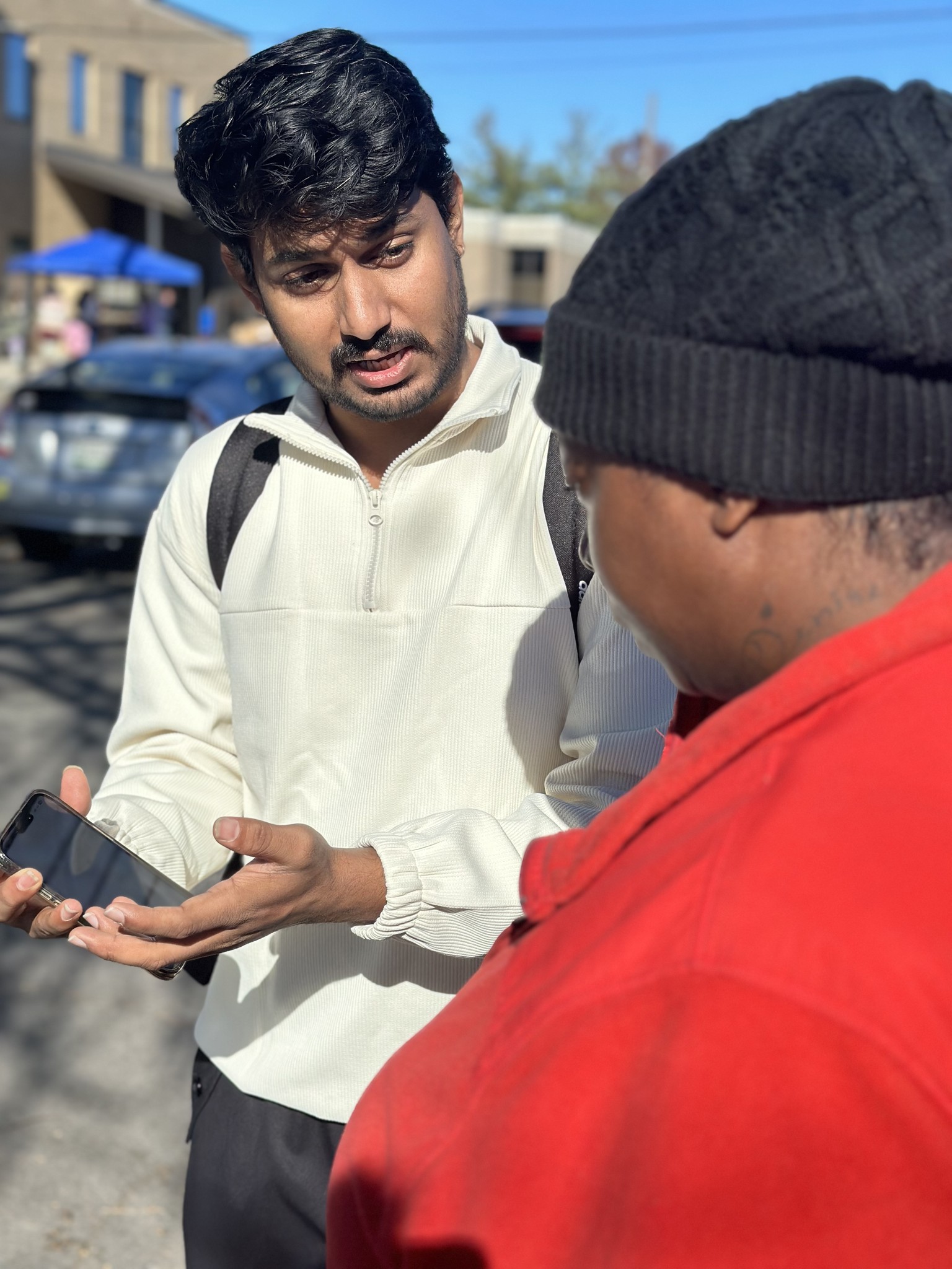
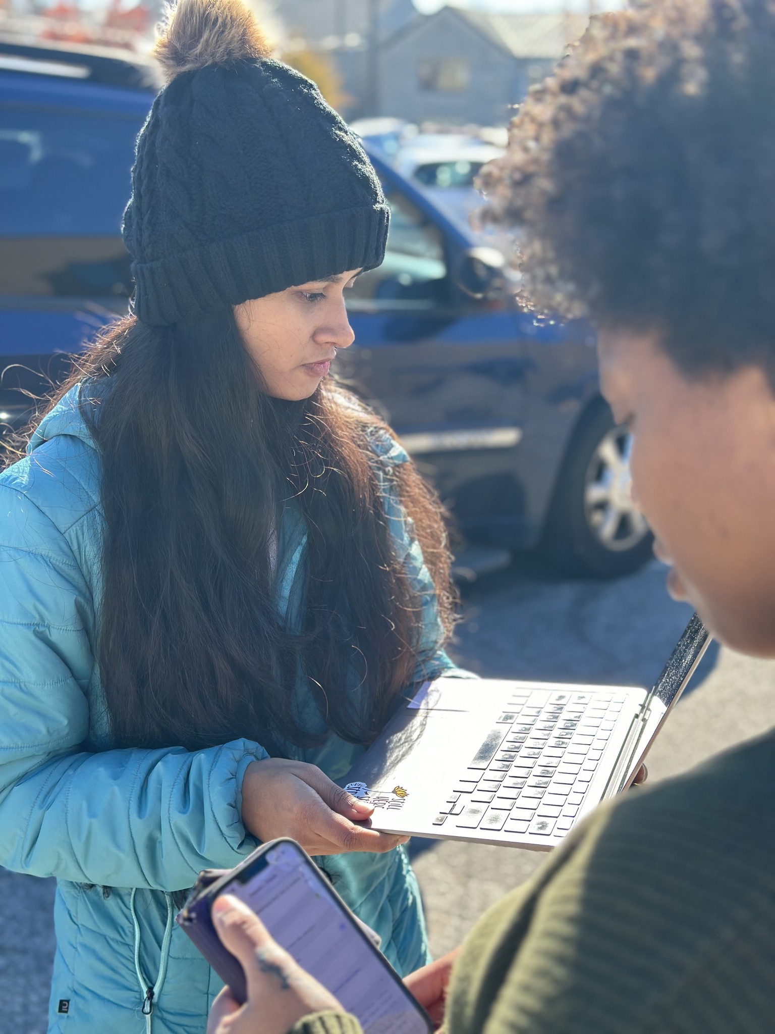
User interviews with deaf students
Heuristic analysis, SUS scoring, and usability testing with over 12 participants.
Data Synthesis &
Conceptualization
Understand user needs and Identify KPIs with Product Manager and other stakeholders
Sketching & Prototyping
Improved information architecture and user flows and created High-fidelity designs
Evaluation &
Re-iteration
Performed A/B tests and time on task efficiency to assess improvements in user satisfaction
The Result?
The Solution
Bridge App actively listens to ongoing conversations, converting speech to text and offering real-time subtitles to the user. The conversation is subsequently saved within the Bridge mobile application. This eliminates the need of an Interpreter at all times.

Voice Contacts
Users have the option to save conversations and categorize them according to voice contacts, simplifying the process of information management for them.
My Impact:
Translated Business Requirements into more than 75 user scenarios
Identifying and segregating voices in real-time
Users have the option to save conversations and categorize them according to voice contacts, simplifying the process of information management for them.
My Impact:
Translated Business Requirements into more than 75 user scenarios
GenAI Assistant
Users have the option to save conversations and categorize them according to voice contacts, simplifying the process of information management for them.
My Impact:
Translated Business Requirements into more than 75 user scenarios
A Deeper Dive
But wait, How did we get there?

Meet Sandy
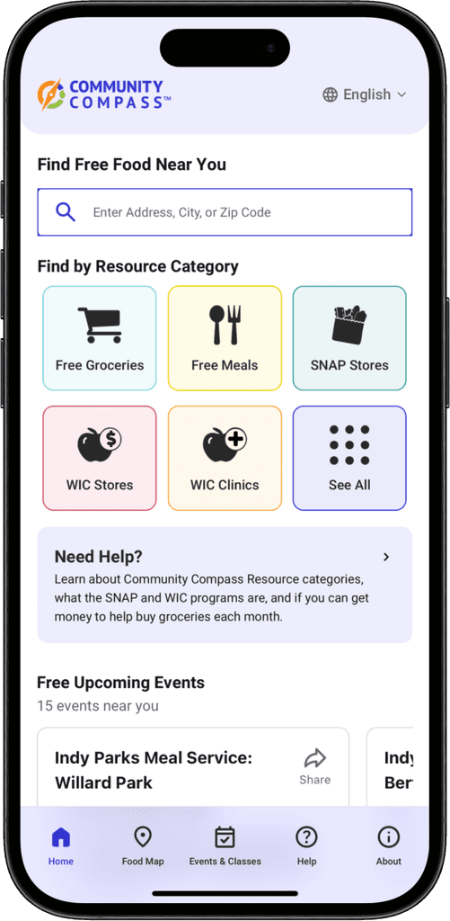
Sandy, a 65-year-old living alone near the suburbs of Indianapolis, relies on her pension fund. She's looking for nearby food banks to help with groceries but isn't very tech-savvy for online searches. Recently, she heard about Community Compass, a potential resource
How does Sandy manage to access the food?
Step 1
See if the user is eligible for
State's benefits
Step 2
To Find a location that can
provide resources
Step 3
Accessing the resources
Re-design Goals
What are Sandy's needs?
Considering our customer base of seniors and veterans, here are the goals and pitfalls to avoid during the redesign.
Simplified Navigation
The user reaches their destination with minimal clicks
Avoid complex user flows with advanced filters and menu options
Minimal Cognitive Load
Interactions should match the user's mental models
Avoid unnecessary jargon
Keep visual consistency
New interface should be familiar & easily adopted by the legacy users
Follow existing design system & Iconography
The above details are based on user research and identified in collaboration with the Product Manager.
User research
What's the user feedback on the application?
To understand the usability of the application, we have conducted
SUS evaluation, Heuristic Evaluation, User Interviews and Think Aloud Sessions
System Usability Scale Score (SUS Score)
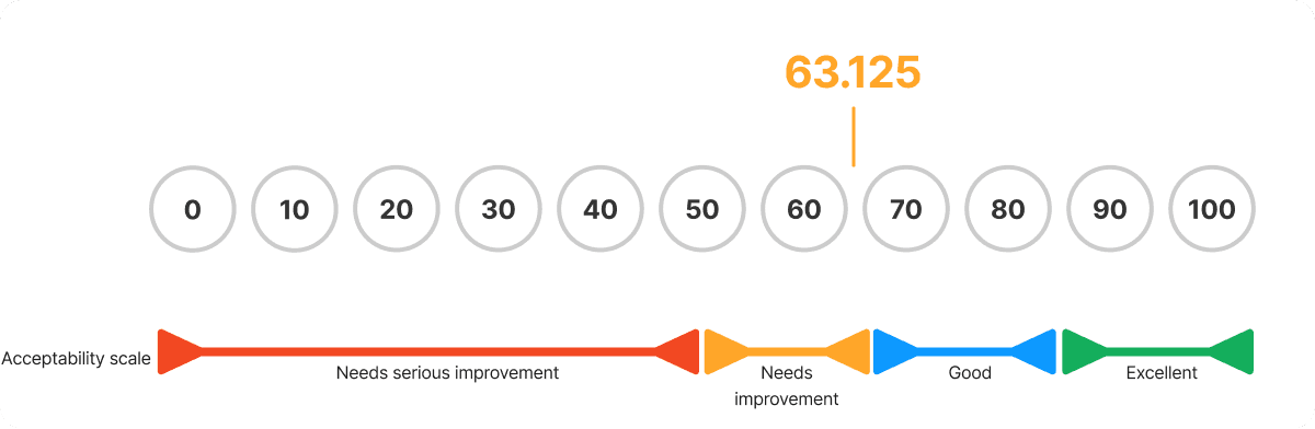
The average System Usability Scale score is 63.125, suggesting that while the app was generally acceptable, there was room for significant improvement.
Pain-point #1
Finding a resource is extensive and the time taken to complete the task is frustrating to the user.
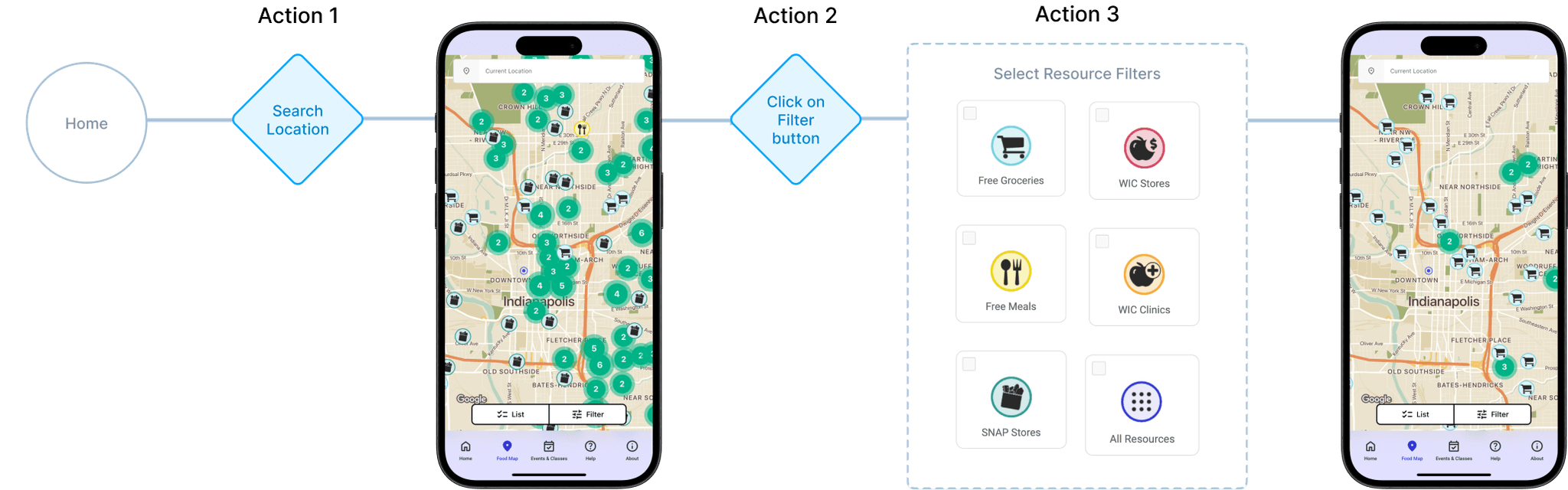
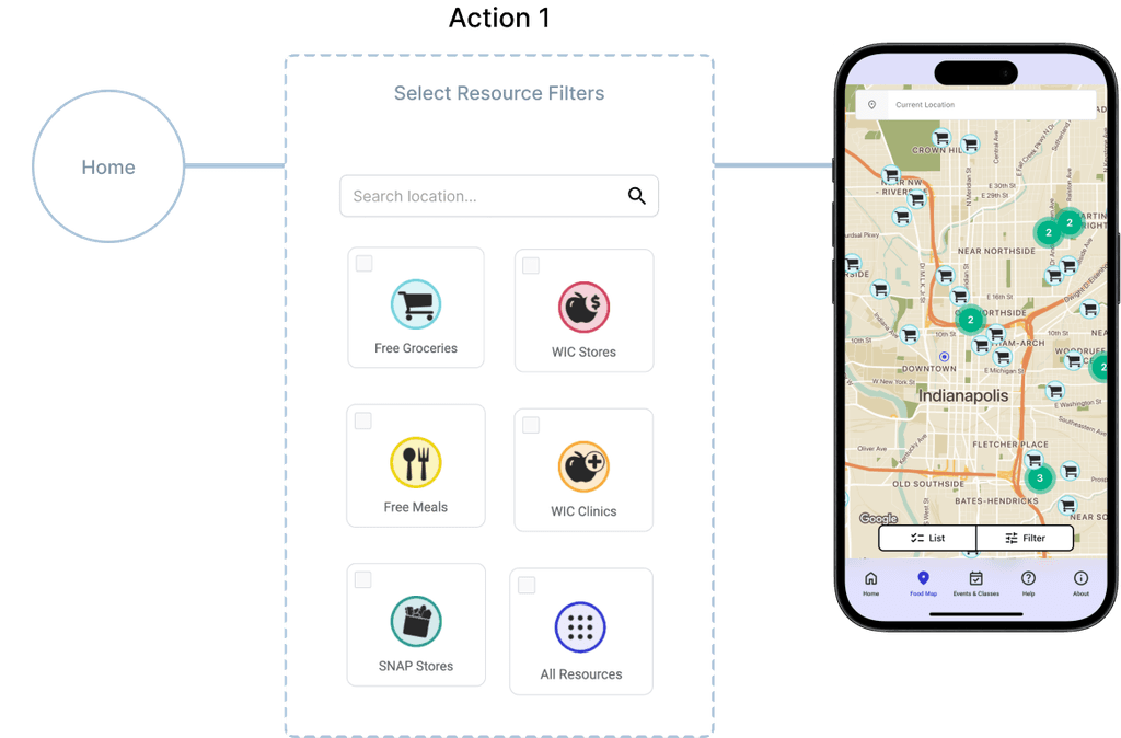
This is caused by the non-intuitive search button and filter choices. The user has the option to use either the location search button or resource category, leading to the user having to take several steps to complete the task
Avg. Time on Task:
3:54s

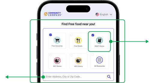
Current flow
The user can not perform both search a location and selecting the resource. Hence, The user has to perform 3 actions to complete the task
My Re-design
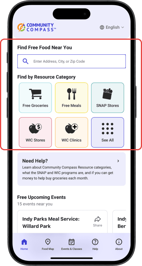
Integrating the search button with filters on the home page reduces the number of steps and narrows down the resources, providing more relevant results.
Design Exploration
Design 1
Matches the user's mental models
Can't see the all the resource categories the app has to offer
Design 2
The icons and checkboxes are small in size and are not accessible
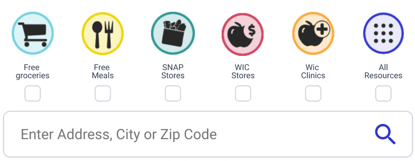
Highlights all the resource categories
Design 3
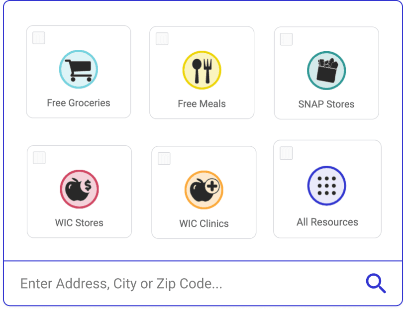
Large Icons and matches the user's mental models
Highlights all the resource categories
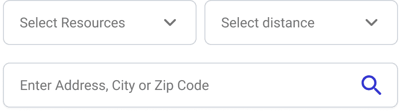
Before
After
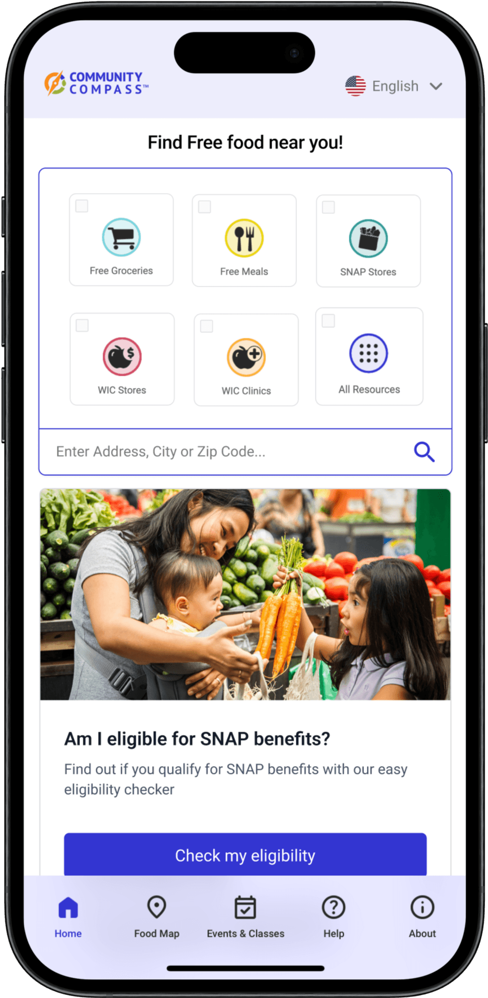
Filtering the resources before searching for a location provides tailored results
Large icons highlights allow users to comprehend the resources provided, also enhancing its use for senior visitors
Filter button is not location on the map for the user to change resource category
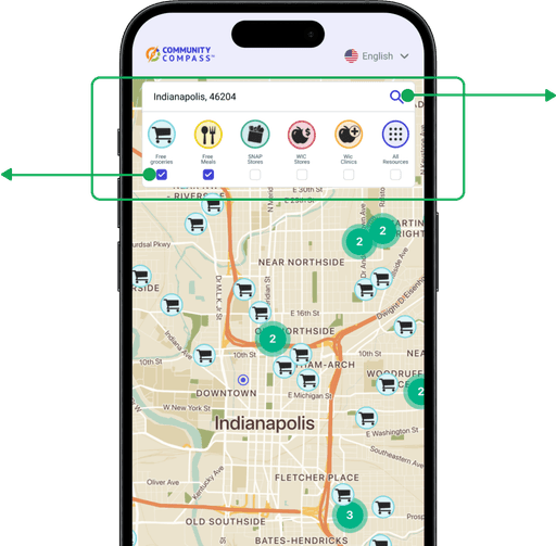
Hierarchy of the search button changes as location is already selected
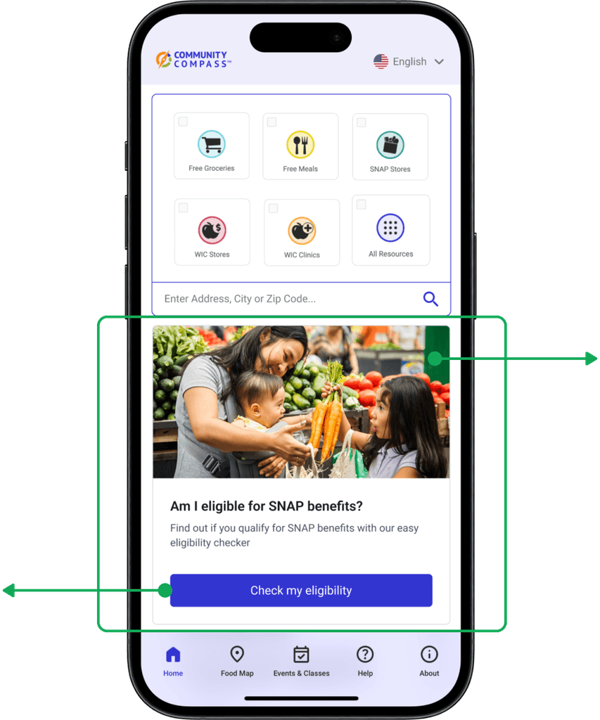
Pain-point #2
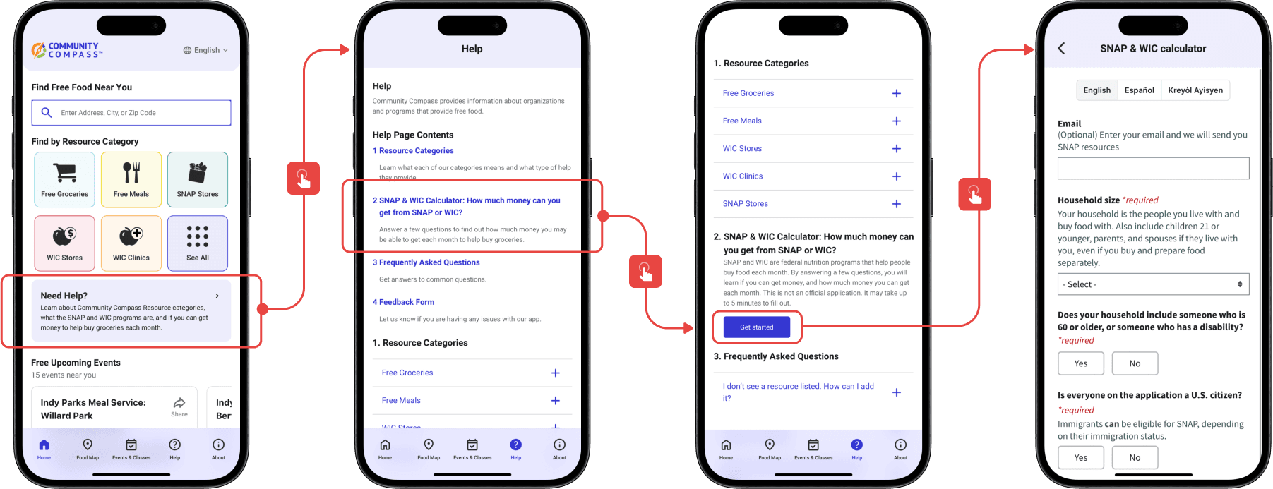
80% of the users were unable to complete the task to see if they are eligible for SNAP or WIC benefits
There is no clear indication of that functionality or a CTA button to guide the user to complete the task

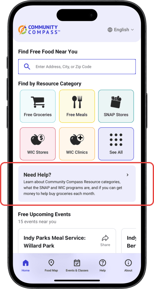
Before
It takes the user 4 steps to land on the Snap and WIC calculator
My Re-design
Re-vamping the Information Architecture
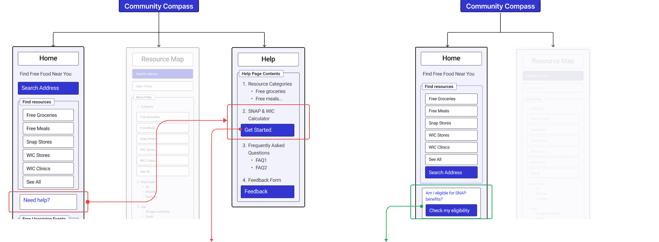
The functionality and CTA are on 2 different pages and is low in information architecture hierarchy
The information architecture hierarchy is now improved with CTA being accessible in the homepage
Having the CTA on the home-page will prompt the user to complete the action
Using an Image draws attention of the users
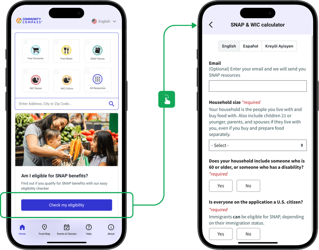
Given that the button is now more apparent and the eligibility questionnaire is readily accessible, this enhances Task completion rate driving conversion rate
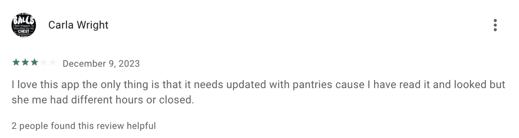
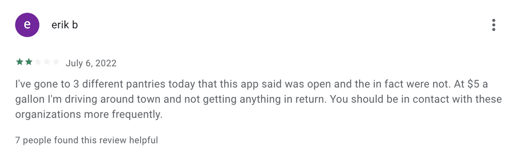
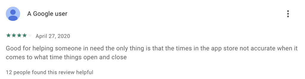
Pain-point #3
Inaccurate resource information such as opening & closing times, events etc.
Reviews from the google Playstore!
Before
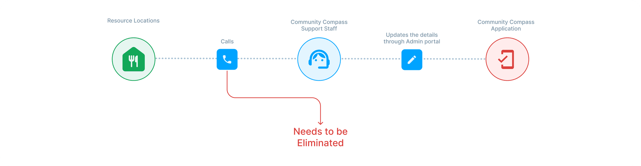
Current user flow of acquiring information
The existing approach involves the support team from Community Compass communicating with food banks, food pantries, etc., directly over the phone to revise location schedules, resulting in abundant inconsistencies in information because timing for events can fluctuate frequently.
My Re-design
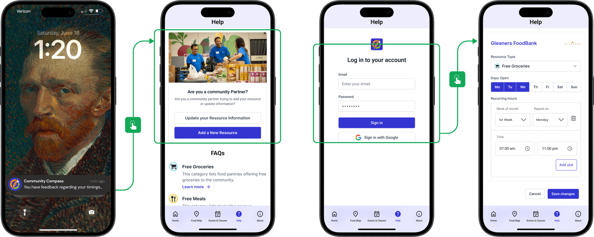
Creating an alternate log-in experience for the community partners to update the data with easy steps
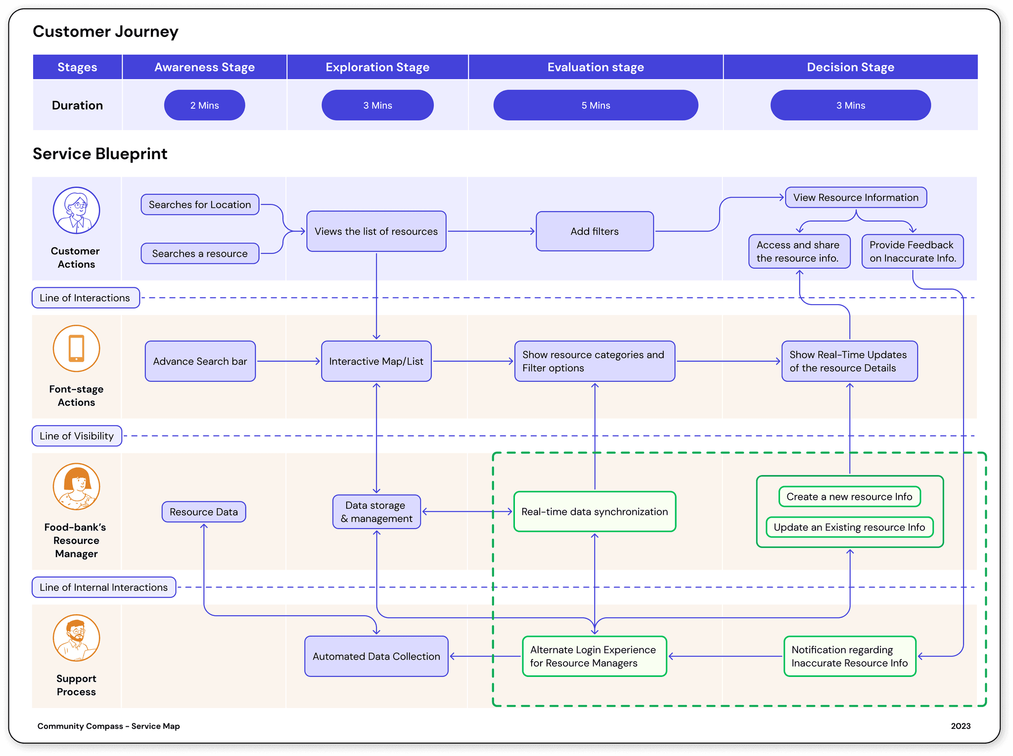
Creating an alternate log-in experience for the community partners to update the data with easy steps
Impact
Evaluating the designs
To Evaluate the overhauled designs, I have conducted A/B testing with 12 Participants and heat maps through usability testing
Before
Time on Task:
3:54s
Prolonged loading times and inefficient user journeys have resulted in extended time required to complete the task
After
Time on Task:
1:17s
Streamlined processes reduced cognitive load, allowing the user to complete the task 67% faster.
What did the user say about the new interface?
My Learnings
Sometimes Small changes can lead to big Impacts
Small changes in UX, like simplifying navigation or enhancing button visibility, can significantly improve user satisfaction and engagement. These minor adjustments can lead to major increases in user retention and overall positive experiences because they reduce friction, make interfaces more intuitive, and help users achieve their goals more efficiently, leading to higher satisfaction and loyalty.
When an existing product is being reworked, Keep Legacy users in mind!
Business needs, fueled by prior investments, can also drive the technology train, leaving UX scrambling to adapt. This highlights the potential tug-of-war between functionality, user needs, and business constraints. It underscores the critical need for early and continuous collaboration between design, engineering, and business teams to ensure seamless product development that prioritizes all stakeholders' needs.
Why "Why?" is the best tool at your disposal
Employing the skill of questioning "Why?" for every detail is deemed one of the most crucial abilities. Consistently asking "Why?" to oneself and engaging with stakeholders remains an effective strategy to enhance understanding.

